By
By
As a data scientist or researcher, creating high-quality visualizations is essential to communicating your findings to others. However, configuring the various settings of a plot in matplotlib can be a tedious task, especially when you're working on a complex project that requires a large number of plots.
Fortunately, a simple solution to this problem is using a global plot configuration file. In this blog post, we will discuss a global plot configuration file, how to create one, and how it simplifies paper writing.
What is a global plot configuration file?
A global plot configuration file is a single file that contains all the settings for a set of matplotlib plots. This file can be used to configure the settings for all plots in a project or even across multiple projects. Using a global plot configuration file saves time by not having to configure each plot's settings individually manually.
The settings that can be configured in a global plot configuration file include the font size, font family, plot style, colors, and axis limits, among others. By setting these values once in the configuration file, you can ensure that all the plots in your project adhere to a consistent style.
How to create a global plot configuration file
Creating a global plot configuration file is a simple process. First, you must create a new Python file containing your configuration settings. You can name this file anything you like, but it's a good idea to give it a descriptive name, like plot_settings.py.
Next, you must import the matplotlib library and configure the settings you want to apply to all your plots. For example, you might want to set the font size, font family, tick direction, and tick size. You can see an example of a global plot configuration file below.
Note: This particular example is set up to work in a APA style paper in greyscale.
import matplotlib.pyplot as plt

# Define Standard Units
fsize = 15
tsize = 18
tdir = 'in'
major = 5.0
minor = 3.0
style = 'default'


# Set all parameters for the plot
plt.style.use(style)
plt.rcParams['text.usetex'] = False
plt.rcParams['font.size'] = fsize
plt.rcParams['legend.fontsize'] = tsize
plt.rcParams['mathtext.fontset'] = 'stix'
plt.rcParams['font.family'] = 'times'
plt.rcParams['xtick.direction'] = tdir
plt.rcParams['ytick.direction'] = tdir
plt.rcParams['xtick.major.size'] = major
plt.rcParams['xtick.minor.size'] = minor
plt.rcParams['ytick.major.size'] = major
plt.rcParams['ytick.minor.size'] = minor
Adding to Your Notebooks
To use the settings defined in your global plot configuration file, import or run it with the magic command %run. I went with the magic command in this case. That's it! Now that you've run this file, all plots in your notebook will use the settings defined in the configuration file.
import numpy as np
import pandas as pd

%run plot_settings.py
Simplifly Research and Academic Paper Writing
When writing a paper, it's important to ensure that all the figures and plots adhere to a consistent style. Using a global plot configuration file, you can ensure that all the plots in your paper have the same font size, font family, and other settings, saving time and making your paper look more professional and cohesive.
Furthermore, you must change your plot settings later in your project. In that case, you can update the configuration file. All the plots will be updated automatically, saving you from having to go through all your plots individually and update their settings manually.
Finally, using a global plot configuration file makes collaborating with other researchers or data scientists easier. If you're working on a project with multiple team members, having a single configuration file that everyone can use ensures that all the plots in the project have the same style and formatting.
Check out my authoring a paper in LaTeX on how to automate your paper with dynamic insertion of updated images: Simplify Your Academic Life With LaTeX on Your Next Paper
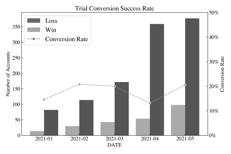
Example Image
Let's check out a sample plot. This plot shows the number of accounts won and lost in a trial period and the conversion rate for the trial period. The conversion rate is calculated by dividing the number of accounts won by the total number of accounts in the trial period.
This plot is more complex than a basic plot, and it contains a custom legend, a line plot, and a bar plot. However, the process for creating this plot is the same as creating a basic plot. In terms of formatting, however, the only thing you'll notice below is the colors for each of the bars and the line plot; the global plot configuration file defines the rest.
fig, ax1 = plt.subplots(figsize=(9, 6))

# Set title
plt.title("Trial Conversion Success Rate")

# Axis 1 is the bar plot for wins and losses
ax1 = sns.barplot(data=df_melted[df_melted['WIN/LOSS'] != 'RATE'],
                  x="DATE",
                  y="VALUE",
                  hue="WIN/LOSS",
                  palette="binary")

# Set left lable for axis 1
ax1.set_ylabel("Number of Accounts")

# Axis two is the line plot for the conversion rate
ax2 = ax1.twinx()
ax2 = sns.lineplot(data=df_melted[df_melted['WIN/LOSS'] == 'RATE'],
                   x="DATE", y="VALUE",
                   hue="WIN/LOSS",
                   palette="Greys",
                   ls="--",
                   marker='o',
                   ax=ax2,
                   legend=False)

# Format as Percents
ax2.yaxis.set_major_formatter(mtick.PercentFormatter())

# Set right lable for axis 2
ax2.set_ylabel("Conversion Rate")

# Change the y scale for axist 2
ax2.set_ylim(0,50)

# Set a custom legend
legend_elements = [Patch(facecolor='dimgray',
                   label='Loss'),
                   Patch(facecolor='darkgrey',
                   label='Win'),
                   Line2D([0],
                   [0],
                   color='grey',
                   ls='--', marker='o',
                   label='Conversion Rate')]

ax1.legend(handles=legend_elements, loc='upper left')

# Save figure
plt.tight_layout()
plt.savefig('Images/img_trial_conversion.png', dpi=300);
Conclusion
In conclusion, a global plot configuration file is useful for simplifying configuring Matplotlib plots. Data scientists and researchers can save time and ensure that all their plots adhere to a consistent style by setting up a file with all the necessary configuration settings, which is especially important when creating presentations or writing papers, as it helps create a professional and cohesive look.