By
By
What is PCA?
Principal Component Analysis or PCA is a dimensionality reduction technique for data sets with many features or dimensions. It uses linear algebra to determine the most important features of a dataset. After these features have been identified, you can use only the most important features, or those that explain the most variance, to train a machine learning model and improve the computational performance of the model without sacrificing accuracy.
PCA finds the axis with the maximum variance and projects the points onto this axis. PCA uses Linear Algebra concepts known as Eigenvectors and Eigenvalues. There is a post on Stack Exchange which beautifully explains it.
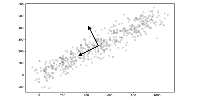
Here is a quick visual of two-dimensional data plotted with their eigenvectors. You can see how one of the vectors is aligned with the dimension with the greatest variance and the other orthogonal. The data is then projected onto this axis, reducing the amount of data but maintaining the overall variance.
Recently I wrote about how PCA can be used for image compression. This time I want to talk about some of the fundamentals of PCA through visualization. As I was learning about PCA and how powerful it is as a tool in your Machine Learning toolbox, I came across two different ways to visualize PCA that finally made it click for me. I thought I would share those two ways with you and take it further and show how models perform with and without dimensionality reduction. The two methods are:
- Explained Variance Cumulative Plot: This is simple but powerful. It immediately tells you how much of the variance in the data is explained by each component and how they combinations of the different components add up to the total variance.
- Principal Components Overlayed with the Original Data: This one is my absolute favorite. You can see the progression of how each principal component brings in slightly more information, and in turn, it becomes hard to distinguish between the different components. This plot is a perfect companion to the Explained Variance Cumulative Plot.
Have you heard enough? Let's go!
Getting Started
The dataset we'll be using is the Wine Data Set from UC Irvine's Machine Learning repository. The data set contains data about wine quality. This dataset is licensed under a Creative Commons Attribution 4.0 International (CC BY 4.0) license.
We will, of course, start by importing the required packages and loading the data.
import numpy as np
import pandas as pd
import warnings
warnings.filterwarnings('ignore')

# Machine Learning
from sklearn import metrics
from sklearn.metrics import ConfusionMatrixDisplay
from sklearn.pipeline import Pipeline
from sklearn.pipeline import FeatureUnion
from sklearn.preprocessing import StandardScaler
from sklearn.decomposition import PCA
from sklearn.decomposition import IncrementalPCA
from sklearn.model_selection import GridSearchCV
from sklearn.model_selection import cross_val_score
from sklearn.model_selection import train_test_split
from sklearn.neighbors import KNeighborsClassifier
from sklearn.ensemble import RandomForestClassifier
from sklearn.linear_model import LogisticRegression

# Plotting
import seaborn as sns
import matplotlib.pyplot as plt
%matplotlib inline
df = pd.read_csv("wine.csv")
This particular dataset has 13 features and a target variable named Class we can use for classification. Each of the values is continuous, and therefore we can directly apply PCA to all variables. Normally we would use PCA on a much higher dimensional dataset, but this dataset will show the concepts.
df.info()
<class 'pandas.core.frame.DataFrame'>
RangeIndex: 178 entries, 0 to 177
Data columns (total 14 columns):
 #   Column                Non-Null Count  Dtype
---  ------                --------------  -----
 0   Class                 178 non-null    int64
 1   Alcohol               178 non-null    float64
 2   Malic acid            178 non-null    float64
 3   Ash                   178 non-null    float64
 4   Ash Alcalinity        178 non-null    float64
 5   Magnesium             178 non-null    int64
 6   Total phenols         178 non-null    float64
 7   Flavanoids            178 non-null    float64
 8   Nonflavanoid phenols  178 non-null    float64
 9   Proanthocyanins       178 non-null    float64
 10  Color intensity       178 non-null    float64
 11  Hue                   178 non-null    float64
 12  OD280/OD315           178 non-null    float64
 13  Proline               178 non-null    int64
dtypes: float64(11), int64(3)
memory usage: 19.6 KB
A quick check for imbalanced data shows us that this dataset, unlike most, is pretty balanced. We'll leave it as is for this demonstration.
df['Class'].value_counts()
2    71
1    59
3    48
Name: Class, dtype: int64
Let's create our X and y variables where X is every feature except the class and y is the class.
y = df['Class'].copy()
X = df.drop(columns=['Class']).copy().values
Find Explained Variance
The first step is to find the explained variance for each principal component. We calculate explained variance by first scaling our data with the StandardScalar and then fitting a PCA model to the scaled data. The Standard Scaler is a simple transformation that normalizes the data to have a mean of 0 and 0 unit variance, or a standard deviation of 1.
You will also notice that the total number of Principal Components equals the number of Features in your dataset. However, one important thing to note is that the Principal Components are not the dataset's columns; rather, PCA is constructing new features that best explain the data.
def get_variance(X, n):
    scaler = StandardScaler()
    pca = PCA(n_components=n)

    pca.fit(scaler.fit_transform(X))

    return pca.explained_variance_ratio_.cumsum()[-1:]
for i in range(1,14):
    print('Components:\t', i, '=\t', get_variance(X, i),
          '\tCumulative Variance')
Components:  1 =     [0.36198848]   Cumulative Variance
Components:  2 =     [0.55406338]   Cumulative Variance
Components:  3 =     [0.66529969]   Cumulative Variance
Components:  4 =     [0.73598999]   Cumulative Variance
Components:  5 =     [0.80162293]   Cumulative Variance
Components:  6 =     [0.85098116]   Cumulative Variance
Components:  7 =     [0.89336795]   Cumulative Variance
Components:  8 =     [0.92017544]   Cumulative Variance
Components:  9 =     [0.94239698]   Cumulative Variance
Components:  10 =    [0.96169717]   Cumulative Variance
Components:  11 =    [0.97906553]   Cumulative Variance
Components:  12 =    [0.99204785]   Cumulative Variance
Components:  13 =    [1.]           Cumulative Variance
Additionally, each of the principal components is summed together, and the total of all components will equal 1. As you look through the list of cumulative variance, you will see that the first component is the most important and the last component is the least important; in other words, the first component contributes the most to the variance. As we include more and more of the components, the contribution amount per component starts to decrease. Let's visualize this by plotting the cumulative variance.
Plot the Threshold for Explained Variance
While the printout of the values is a good start, we can improve by plotting each of these values. Additionally, we will plot a line that represents 95% of the explained variance. While there is no rule as to how much explained variance you need to include in a model, 95% is a good threshold to start. Later, we will perform a grid search to find the optimal number of components to use in a model.
scaler = StandardScaler()
data_rescaled = scaler.fit_transform(X)

pca = PCA().fit(data_rescaled)

plt.rcParams["figure.figsize"] = (8,5)

fig, ax = plt.subplots()
xi = np.arange(1, 14, step=1)
y = np.cumsum(pca.explained_variance_ratio_)

plt.ylim(0.0,1.1)
plt.plot(xi, y, marker='o', linestyle='-', color='black')

plt.xlabel('Number of Components')
plt.xticks(np.arange(1, 14, step=1))
plt.ylabel('Cumulative variance (%)')
plt.title('The number of components needed to explain variance')

plt.axhline(y=0.95, color='grey', linestyle='--')
plt.text(1.1, 1, '95% cut-off threshold', color = 'black', fontsize=16)

ax.grid(axis='x')
plt.tight_layout()
plt.savefig('pcavisualize_1.png', dpi=300)
plt.show()
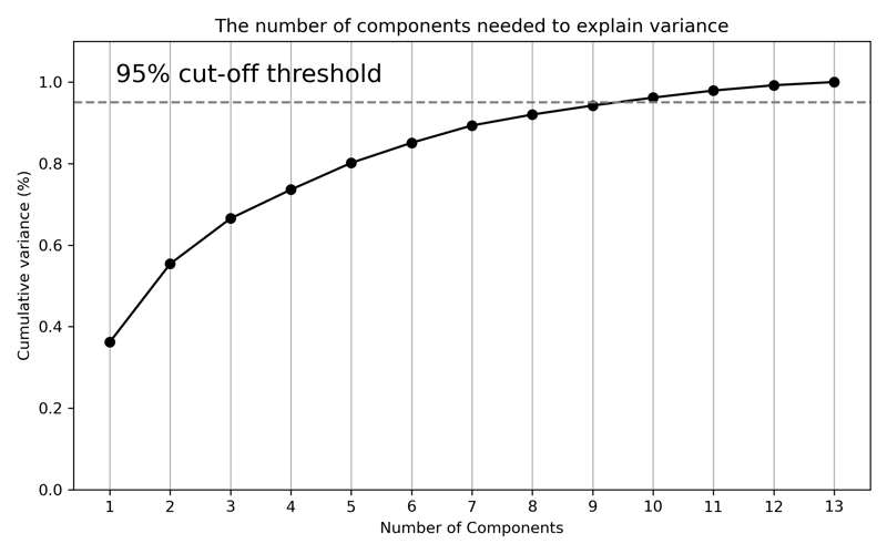
After plotting the cumulative explained variance, we can see how the curve flattens slightly around 6 or 7 components. And where our line is drawn for 95%, the total explained variance is at approximately 9 components. And that is explained variance visualized! Let's move on to plotting the actual components.
Plotting Each Component vs. Original Data
The next step is to visualize the data resulting from each component rather than the explained variance. We will use the inverse_transform method of the PCA model, and this will take each of the components and transform them back into the original data scale. We will plot the entire range of components from 1-13 and overlay them with the original data.
def transform_pca(X, n):

    pca = PCA(n_components=n)
    pca.fit(X)
    X_new = pca.inverse_transform(pca.transform(X))

    return X_new
rows = 4
cols = 4
comps = 1

scaler = StandardScaler()
X_scaled = scaler.fit_transform(X)

fig, axes = plt.subplots(rows,
                         cols,
                         figsize=(12,12),
                         sharex=True,
                         sharey=True)


for row in range(rows):
    for col in range(cols):
        try:
            X_new = transform_pca(X_scaled, comps)
            ax = sns.scatterplot(x=X_scaled[:, 0],
                                 y=X_scaled[:, 1],
                                 ax=axes[row, col],
                                 color='grey',
                                 alpha=.3)
            ax = sns.scatterplot(x=X_new[:, 0],
                                 y=X_new[:, 1],
                                 ax=axes[row, col],
                                 color='black')
            ax.set_title(f'PCA Components: {comps}');

            comps += 1
        except:
            pass
plt.tight_layout()
plt.savefig('pcavisualize_2.png', dpi=300)
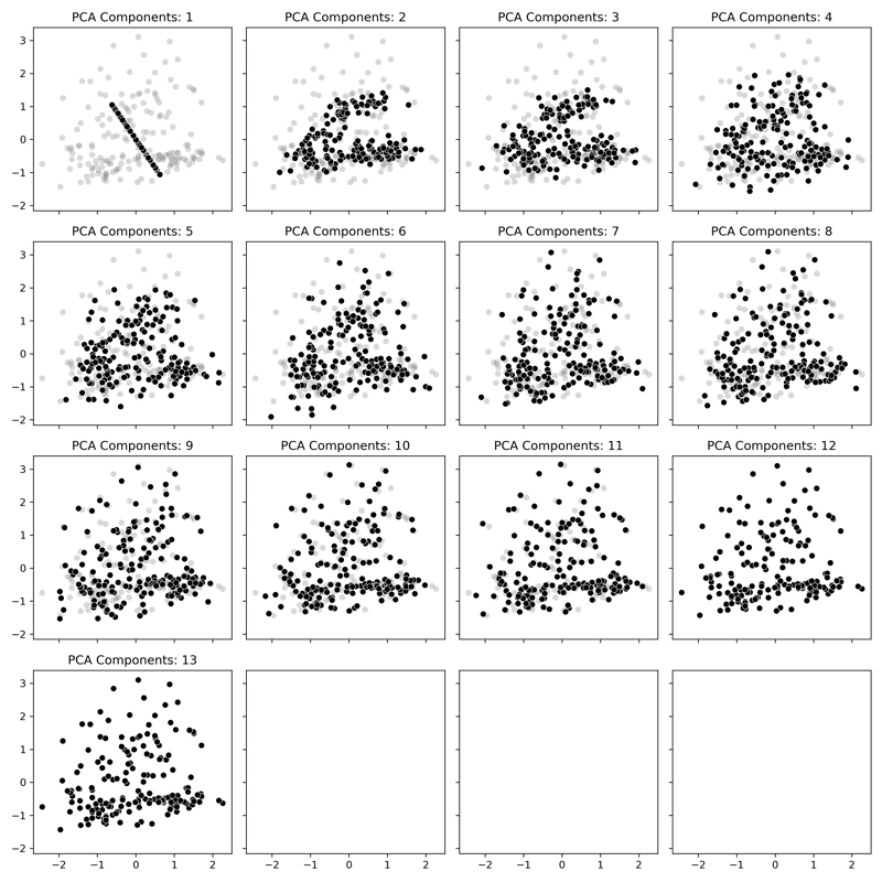
In our plot, the gray data is the original data, and the black points are the Principal Components. With just one component displayed, it takes the form of a set of points projected on a line that goes is along the axis with the most variance in the original data. As more and more components are added, we can see how the data starts to resemble the original data even though there is less information being displayed. By the time we get into the upper values, the data starts to match the original data where finally, at all 13 components, it is the same as the original.
And there is my favorite way to visualize PCA! Now let's put it into action with a machine learning classification model.
Comparing PCA and Non-PCA Classification Models
Let's run three classifiers against our dataset, both with and without PCA applied, and see how they perform. We'll compare them utilizing only the first two components (n_components=2) to make it interesting. We'll compare KNeighborsClassifier, RandomForestClassifier, and LogisticRegression as our classifiers and see how they perform.
As always, we'll use a pipeline to combine our data preprocessing and PCA into a single step. We'll scale our data with the same StandardScaler we used previously and then fit the data with a certain number of components. Since we'll use this function a few times in our workflow, we've set it up to be flexible.
def create_pipe(clf, do_pca=False, n=2):

    scaler = StandardScaler()
    pca = PCA(n_components=n)

    if do_pca == True:
        combined_features = FeatureUnion([("scaler", scaler),
                                          ("pca", pca)])
    else:
        combined_features = FeatureUnion([("scaler", scaler)])

    pipeline = Pipeline([("features", combined_features),
                         ("clf", clf)])


    return pipeline
Next is looping over the different classifiers and performing Cross-Validation. As mentioned, we'll try three different classifiers and test them each with and without PCA applied.
models = {'KNeighbors' : KNeighborsClassifier(),
          'RandomForest' : RandomForestClassifier(random_state=42),
          'LogisticReg' : LogisticRegression(random_state=42),
          }


def run_models(with_pca):
    for name, model, in models.items():
        clf = model
        pipeline = create_pipe(clf, do_pca = with_pca, n=2)
        scores = cross_val_score(pipeline, X,
                                 y,
                                 scoring='accuracy',
                                 cv=3, n_jobs=1,
                                 error_score='raise')
        print(name, ': Mean Accuracy: %.3f and Standard Deviation: \
             (%.3f)' % (np.mean(scores), np.std(scores)))

print(68 * '-')
print('Without PCA')
print(68 * '-')
run_models(False)
print(68 * '-')
print('With PCA')
print(68 * '-')
run_models(True)
print(68 * '-')
--------------------------------------------------------------------
Without PCA
--------------------------------------------------------------------
KNeighbors : Mean Accuracy: 0.944 and Standard Deviation: (0.021)
RandomForest : Mean Accuracy: 0.961 and Standard Deviation: (0.021)
LogisticReg : Mean Accuracy: 0.972 and Standard Deviation: (0.021)
--------------------------------------------------------------------
With PCA
--------------------------------------------------------------------
KNeighbors : Mean Accuracy: 0.663 and Standard Deviation: (0.059)
RandomForest : Mean Accuracy: 0.955 and Standard Deviation: (0.021)
LogisticReg : Mean Accuracy: 0.972 and Standard Deviation: (0.028)
--------------------------------------------------------------------
Magic! We see that without PCA, all three models perform fairly well. However, with only the first two components, RandomForest performs nearly the same, and LogisticRegression performed identically to the original! Not all use cases would turn out like this, but hopefully, that gives a peek into the power of PCA. If you refer back to the plot above with each of the components overlaid, you can see just how much less data is needed.
Find the Optimal Number of Components
For this portion, we'll use the train_test_split function to split the dataset into 70/30% partitions and then use the GridSearch feature to find optimal parameters. The most critical parameter we want to validate is the performance of various PCA component numbers.
As we saw from the scatterplots above, when we approach higher numbers like 9, the dataset after transformation looks a lot like the original with 95% of the variation explained by the transformed dataset. We also saw how only 2 components performed well, so we can test the entire range from 1-13 and find the best setting.
# Make training and test sets
X_train, X_test, y_train, y_test = train_test_split(X,
                                                    y,
                                                    test_size=0.3,
                                                    random_state=53)
Tuning the Model
Next, we'll perform what's called Hyperparameter Tuning. After selecting the model based on the cross-validation utilizing default parameters, we perform a Grid Search to fine-tune the model and select the best parameters. We'll loop over three things
- Number of Components, from
2to13. - Regularization Parameter
C, from0.1to100 - Solver Parameter
solver, from'liblinear'to'saga' - Penalty Parameter
penalty, froml1tol2
Check out the documentation for LogisticRegression for more information on the parameters.
def get_params(parameters, X, y, pipeline):

    grid = GridSearchCV(pipeline,
                        parameters,
                        scoring='accuracy',
                        n_jobs=1,
                        cv=3,
                        error_score='raise')
    grid.fit(X, y)

    return grid
clf = LogisticRegression(random_state=41)
pipeline = create_pipe(clf, do_pca=True)

param_grid = dict(features__pca__n_components = list(range(2,14)),
                 clf__C = [0.1, 1.0, 10, 100],
                 clf__solver = ['liblinear', 'saga'],
                 clf__penalty = ['l2', 'l1'])

grid = get_params(param_grid, X_train, y_train, pipeline)

print("Best cross-validation accuracy: {:.3f}".format(grid.best_score_))
print("Test set score: {:.3f}".format(grid.score(X_test, y_test)))
print("Best parameters: {}".format(grid.best_params_))
Best cross-validation accuracy: 0.976
Test set score: 0.944
Best parameters: {'clf__C': 10, 'clf__penalty': 'l1',
'clf__solver': 'liblinear', 'features__pca__n_components': 2}
Simple as that - after performing the Grid Search, we can see a few settings that performed the best. We can see that the best parameters are C=10, penalty='l1', solver='liblinear' and n_components=2. We can also see that the test set score is close to the best cross-validation score. We can also see that the cross-validation accuracy improved a little from 0.972 to 0.976.
As a side note, this is pretty typical of Hyperparameter Tuning. You don't get massive improvements; it's small, incremental improvements, and the biggest gains are through feature engineering and model selection.
Model Validation
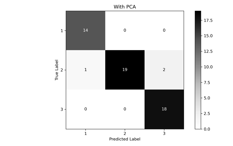
Perform a final fit and test with the new parameters. One for our optimized Number of Components (2) and one for a set of data that has not had PCA performed on it. We'll print out a classification report and generate a confusion matrix to compare the results.
def fit_and_print(pipeline):

    pipeline.fit(X_train, y_train)
    y_pred = pipeline.predict(X_test)

    print(metrics.classification_report(y_test, y_pred, digits=3))

    ConfusionMatrixDisplay.from_predictions(y_test,
                                            y_pred,
                                            cmap=plt.cm.Greys)

    plt.tight_layout()
    plt.ylabel('True Label')
    plt.xlabel('Predicted Label')
    plt.show;
clf = LogisticRegression(C=10,
                         penalty='l1',
                         solver='liblinear',
                         random_state=41)
pipeline = create_pipe(clf, do_pca=True, n=2)
fit_and_print(pipeline)
              precision    recall  f1-score   support

           1      0.933     1.000     0.966        14
           2      1.000     0.864     0.927        22
           3      0.900     1.000     0.947        18

    accuracy                          0.944        54
   macro avg      0.944     0.955     0.947        54
weighted avg      0.949     0.944     0.944        54
clf = LogisticRegression(C=10,
                         penalty='l1',
                         solver='liblinear',
                         random_state=41)
pipeline = create_pipe(clf, do_pca=False)
fit_and_print(pipeline)
              precision    recall  f1-score   support

           1      1.000     1.000     1.000        14
           2      1.000     0.955     0.977        22
           3      0.947     1.000     0.973        18

    accuracy                          0.981        54
   macro avg      0.982     0.985     0.983        54
weighted avg      0.982     0.981     0.982        54

In the end, while the performance of PCA is lower than the full dataset, we can see that we were able to come fairly close with only using the first two components. If we had a much larger, much higher dimensional dataset, we could dramatically improve performance without significant accuracy loss.
Conclusion
PCA is an incredible tool that automatically transforms data to a simpler representation without losing much information. You apply PCA to the continuous variables in a dataset and then optimize through a grid search to find the best number of components for your model and use case. While this was a simple overview, I hope you found this useful! All the code for this post is available on GitHub.