By
By
Introduction to Regression
Linear Regression is the most common type of regression analysis and is an incredibly powerful tool. On smaller projects or business-oriented use cases, you might find a simple linear regression model using Excel is the perfect tool for you to complete your analysis quickly.
Regression analysis helps you examine the relationship between two or more variables. We use y to represent the dependent variable and X to represent the independent variable. The dependent variable X is the one that is fixed in nature or inputs into your model, and the y variable is the one that you are predicting with the model.
- Independent variables are also known as predictor or explanatory variables.
- Dependent variables are also known as response variables.
It is also common with a simple linear regression model to utilize the Ordinary Least Squares (OLS) method for fitting the model. In the OLS method, the model's accuracy is measured by the sum of squares for the residuals of each predicted point. The residual is the orthogonal distance between the point in the dataset and the fitted line.
Today, our example will illustrate the simple relationship between the number of usersin a system versus our Cost of Goods Sold (COGS). Through this analysis, we'll not only be able to see how strongly the two variables are correlated but also use our coefficients to predict the COGS for a given number of users.
Let's look at our data and a scatter plot to understand the relationship between the two. As they say, a picture is worth a thousand words.
USERS        COGS
182,301      $4,761,393
232,824      $5,104,714
265,517      $5,023,121
307,827      $5,834,911
450,753      $5,599,829
484,245      $6,712,668
535,776      $7,083,847
594,604      $7,296,756
629,684      $7,602,863
659,109      $7,643,765
694,050      $7,739,618
874,305      $9,147,263
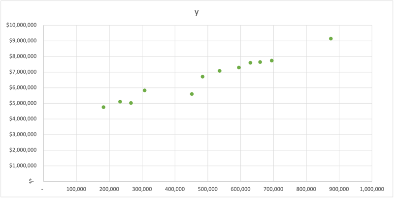
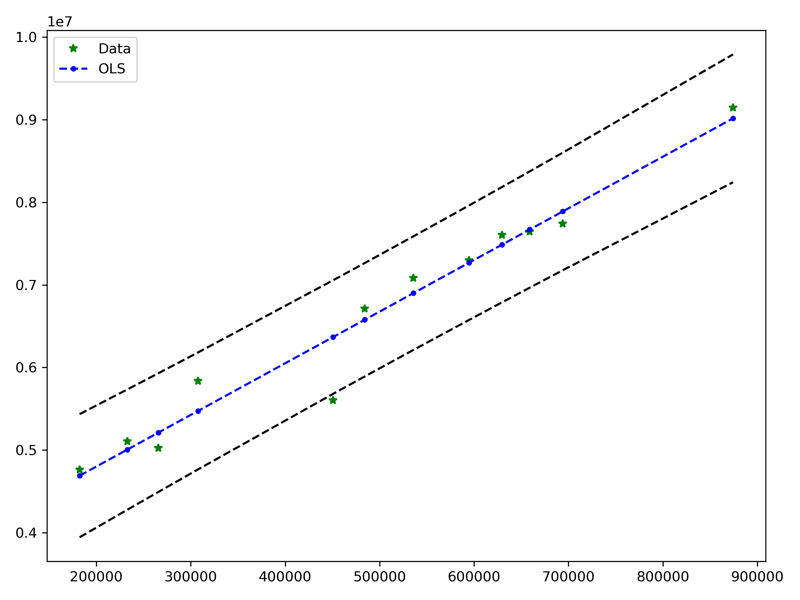
Upon a quick observation of the data, we see a positive (up and to the right) relationship between our COGS and USERS. Let's dig in a little further and see how we build our models with R, Python, and Excel
Regression in R
Let's start with R, a statistical computing platform extremely popular in the Data Science and Analytics communities. R is open source, and the ecosystem of libraries is extensive!
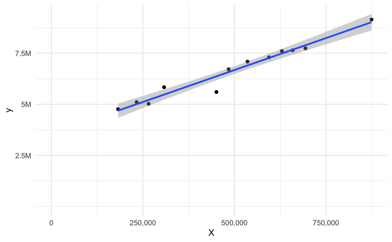
We'll quickly build a model bypassing our X and y data into the lm function. One of the things that I love about the R implementation is the summary function, and it outputs a table that contains most of what you need to interpret the results.
library(ggplot2)

X <- c(182301, 232824, 265517, 307827, 450753, 484245,
535776, 594604, 629684, 659109, 694050, 874305)
y <- c(4761393, 5104714, 5023121, 5834911, 5599829,
6712668, 7083847, 7296756, 7602863, 7643765, 7739618, 9147263)

data <- data.frame(X, y)

# Output a text based summary of the regression model
model <- lm(y ~ X, data = data)
summary(model)

# Plot the results
ylab <- c(2.5, 5.0, 7.5, 10)
ggplot(data = data, mapping = aes(x = X, y = y)) +
    geom_point() +
    geom_smooth(method = "lm", se = TRUE, formula = y~x) +
    theme_minimal() +
    expand_limits(x = c(0,NA), y = c(0,NA)) +
    scale_y_continuous(labels = paste0(ylab, "M"),
        breaks = 10^6 * ylab) +
    scale_x_continuous(labels = scales::comma)
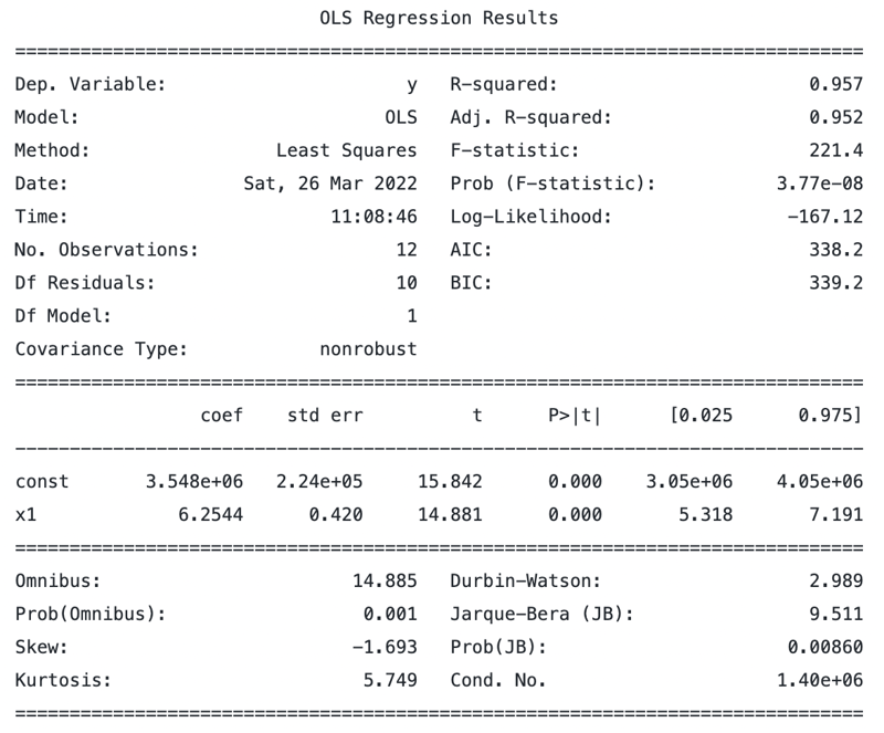
Call:
lm(formula = y ~ X, data = data)

Residuals:
    Min      1Q  Median      3Q     Max
-767781  -57647   86443  131854  361211

Coefficients:
             Estimate Std. Error t value Pr(>|t|)
(Intercept) 3.548e+06  2.240e+05   15.84 2.07e-08 ***
X           6.254e+00  4.203e-01   14.88 3.77e-08 ***
---
Signif. codes:  0 ‘***’ 0.001 ‘**’ 0.01 ‘*’ 0.05 ‘.’ 0.1 ‘ ’ 1

Residual standard error: 296100 on 10 degrees of freedom
Multiple R-squared:  0.9568,    Adjusted R-squared:  0.9525
F-statistic: 221.4 on 1 and 10 DF,  p-value: 3.775e-08
In the summary output is a way to quickly identify the coefficients that are statistically significant with the notation:
Signif. codes: 0 ‘***’ 0.001 ‘**’ 0.01 ‘*’ 0.05 ‘.’ 0.1 ‘ ’ 1
Additionally, ggplot2 is a powerful visualization library that allows us to easily render the scatterplot and the regression line for a quick inspection.
Regression in Python
If you're interested in producing similar results in Python, the best way is to use the OLS(Ordinary Least Squares) model from statsmodels. It has the closest output to the base R lm package producing a similar summary table. We'll start by importing the packages we need to run the model.
import matplotlib.pyplot as plt
import statsmodels.api as sm
Next, let's prepare our data. We'll start with two Python lists for our X and y data. Additionally, we need to add a constant to our data to account for the intercept.
X = [182301, 232824, 265517, 307827, 450753, 484245,
     535776, 594604, 629684, 659109, 694050, 874305]
y = [4761393, 5104714, 5023121, 5834911, 5599829, 6712668,
     7083847, 7296756, 7602863, 7643765, 7739618, 9147263]

# Add an intercept
X_i = sm.add_constant(X)
X_i
array([[1.00000e+00, 1.82301e+05],
       [1.00000e+00, 2.32824e+05],
       [1.00000e+00, 2.65517e+05],
       [1.00000e+00, 3.07827e+05],
       [1.00000e+00, 4.50753e+05],
       [1.00000e+00, 4.84245e+05],
       [1.00000e+00, 5.35776e+05],
       [1.00000e+00, 5.94604e+05],
       [1.00000e+00, 6.29684e+05],
       [1.00000e+00, 6.59109e+05],
       [1.00000e+00, 6.94050e+05],
       [1.00000e+00, 8.74305e+05]])
And next, we can fit the model to our data and print a summary similar to R. Note that we're utilizing sm.OLS for the Ordinary Least Squares method.
mod = sm.OLS(y, X_i)
results = mod.fit()
print(results.summary())
pred_ols = results.get_prediction()
iv_l = pred_ols.summary_frame()["obs_ci_lower"]
iv_u = pred_ols.summary_frame()["obs_ci_upper"]

fig, ax = plt.subplots(figsize=(8, 6))

ax.plot(X, y, "*", label="Data", color="g")
ax.plot(X, results.fittedvalues, "b--.", label="OLS")
ax.plot(X, iv_u, "k--")
ax.plot(X, iv_l, "k--")
ax.legend(loc="best")
Regression in Excel!
Finally! Let's use the Excel application to perform the same regression analysis. One of the things about Excel is that it has AMAZING depth in numerical analysis that many users have never discovered. Let's look at how we can perform the same analysis using Excel but accomplish it in just a few minutes!
Setup
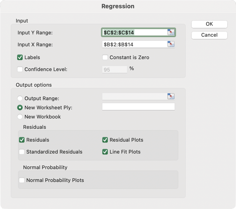
Start by navigating to the Data Analysis pack, located in the Data tab.
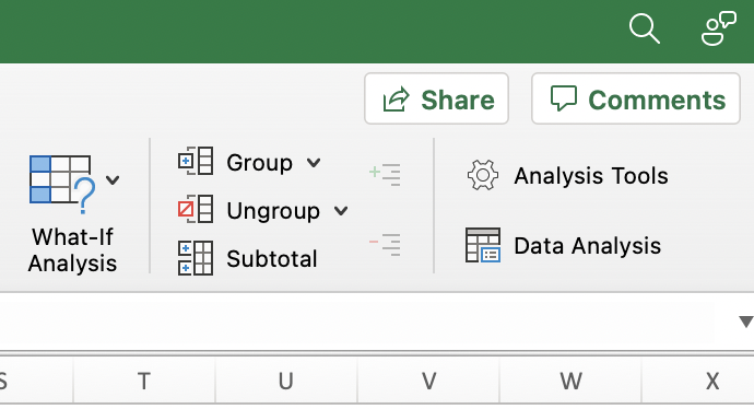
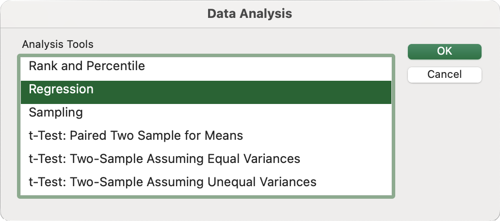
From here, we can select the Regression tool.
And as with most things in Excel, we simply populate the dialog with the right rows and columns and set a few additional options. Here are some of the most common settings that you should choose to give you a robust output.
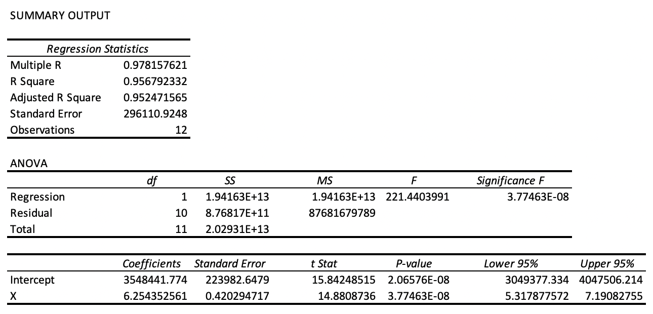
And finally, we can see the output from our analysis. Excel creates a new sheet with the results. It contains evaluation statistics such as the R-Squared and Adjusted R-Squared. It also produces and ANOVA table producing values such as the Sum of Squares (SS), Mean Squared Error (MS), and F-statistic. The F-statistic can tell us if the model is statistically significant, typically when the value is less than 0.05.
Results
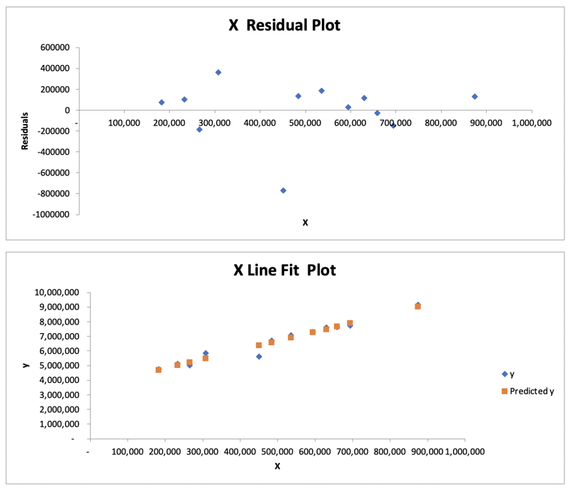
Excel also provides several plots for visual inspection, such as the Residual Plot and the Line Fit Plot. For more information on interpreting a residual plot, check out this article: How to use Residual Plots for regression model validation?
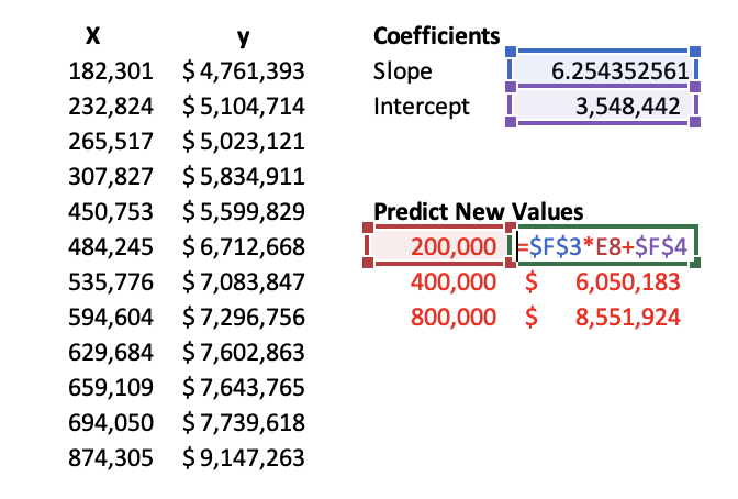
Predicting New Values
Next, we might want to predict new values. There are a couple of ways to do this. The first is that you can directly reference the cell outputted from the regression analysis tool in Excel. The second is computing the slope and intercept yourself and using this in our regression formula. You will use two formulas, appropriately named =SLOPE and =INTERCEPT. Select the appropriate X and y cells in the formula below.
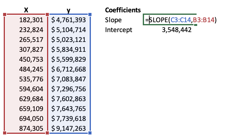
Once you have your slop and intercept, you can plug them into the linear regression equation. Because this is a simple linear regression, we can think of this as the equation of a line or Y = MX + B where M is the Slope and B is the Y-Intercept. Something we learned back in high school math is now paying dividends in data science!
Conclusion
We covered linear regression and specifically a simple linear regression consisting of two variables and the Ordinary Least Squares method of evaluating the model's accuracy.
- First, we walked through how R performs this regression using the base
lmfunction. - Next, we looked at how Python does the same thing with the
statsmodelspackage. - Finally, we saw how the Data Analysis Regression tool in Excel performed the same analysis with a few buttons!
When it comes to a simple linear regression model, Excel provides a comprehensive tool for performing an analysis. While R and Python can perform a similar analysis, you can get the same results using Excel!