By
By
How to Create a Compelling Slide Deck
As data scientists or analysts, we spend countless hours perfecting our ability to analyze data, build machine learning models, and keep up with the latest technology trends. One skill, however, that everyone needs is the ability to create a compelling presentation.
Every Data Scientist, Analyst, and Data Engineer needs to get good at building a compelling presentation.
Here are tips and tricks I've gathered over 20 years of presenting to executives, customers, and peers. None of these tips are limited to Data Science and can be used by anyone creating a presentation; let's take a quick look at them.
- Start With an Outline
- Storytelling with Situation, Complication, Resolution
- The One Minute Per Slide Rule
- The Rule of Three
- Write Slide Titles as Outcomes
- Reading Titles Outloud
- Focus Your Audience's Attention
- Creating Compelling Data Visualizations
Let's get started!
Start With an Outline
When starting a presentation, they often open PowerPoint, Keynote, or their tool of choice and start trying to build the deck immediately. This issue, of course, is that you're going to iterate 100 times on the slides and probably end up deleting most of what you've created.
A better way to approach this is to start with an outline, No different than you were taught in English 101. But don't think of this as an outline of the slides you want to create. Think of the outline as the story you're going to tell. There are two common ways to create an outline. The first is simply using ordered lists and structuring your outline by ideas or sections of your story (I'll cover the storytelling part next). If you're a more visual person, you can use a mind map and structure it similarly.
Once you have your outline set, creating the supporting content is a breeze.
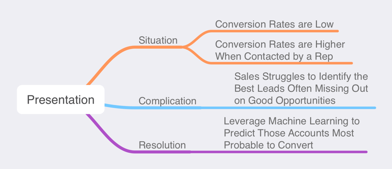
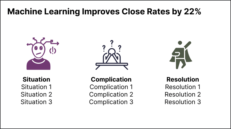
Storytelling with Situation, Complication, Resolution
A classic storytelling framework is the Hero's Journey. The general idea is that a hero goes on a journey and introduces some obstacles; finally, the hero can overcome that obstacle, and everyone lives happily ever after.
In our business presentations, we can use a similar framework called Situation-Complication-Resolution or SCR. I was first introduced to SCR through the book The Pyramid Principle by Barbara Minto, who popularized this method while working at McKinsey Consulting. The structure of this is perfect for creating a business story. It's a simple framework that keeps you organized in your structure, brings action-oriented results, and fits into the Rule-of-Three, which I'll cover later.
- Situation: Facts about the current state.
- Complication: Action is required based on the situation.
- Resolution: The action is taken or recommended to solve the complication.
Using our outline format, here is an overly simplified example of SCR. In practice, you would introduce more details as sub-items of the nodes. Utilizing SCR will help you create a clean, compelling story!
The One Minute Per Slide Rule
This one is simple and effective. Instead of creating your presentation and rehearsing the timing, consider that each major content slide will take one minute to present. If you have a 20-minute presentation, aim for 20 slides with content. You should not include section dividers, the cover, or a closing logo slide in your count. I've found over the years that, generally speaking, some will take longer, some will be shorter, but on average, they'll take about a minute.
Eliminate the stress from figuring out how much content you need to create.
The Rule of Three
Another guiding principle is the Rule of Three. The rule of three is simple: stick with three and only three items when building your structure, sections of your story, or the number of bullet points on your slide.
Apple has implemented this all over their presentation and product lines, and science has shown that our brain loves patterns and three is the minimum number needed to form a pattern.
Structuring your slides utilizing the rule of three will help your audience remember your content and simplify building the presentation. You might be tempted to think, "more information is better with four, six, or eight bullet points. No one will be able to follow all that, so cut it down to the three most impactful messages.
Another trick if you have slightly more information is to structure it three-by-three like the image below.
Write Slide Titles as Outcomes
I often see the mistake of Data Scientists writing their slide titles describing what is on the slide vs. what the outcome or takeaway of the slide is. This simple practice you can get into will dramatically improve your presentation with little effort. Let's take a look at a couple of examples.
| Subject-Based | Outcome-Based |
|---|---|
| Algorithm Training and Validation | Predict Customer Churn with 92% Accuracy |
| Q1 Conversation Rates | Accounts With Direct Contact are 5x More Likely to Purchase |
| Utilizing XGBoost to Classify Accounts | Machine Learning Improves Close Rates by 22% |
It is pretty clear with examples like this which is more compelling to your audience. Remember, your slide titles are the outcome of your slide!
Reading Titles Outloud
There are plenty of articles that will tell you not to read your slides out loud. Reading your content directly from your slides is a sure-fire way to bore your audience and lose their attention.
However, I have one caveat to that rule; read your slide titles out loud.
According to Naegle:
Reading and verbal processing use the same cognitive channels—therefore, an audience member can either read the slide, listen to you, or do some part of both (each poorly) due to cognitive overload.
By reading just the tile and title only as you start each slide, the audience will be able to process the message much more easily than reading the written words and listening to you simultaneously. While this might feel uncomfortable initially, practice it with some colleagues and see for yourself!
For the rest of the slide, do not read the content, especially if you use a lot of bulleted or ordered lists. Reading all of your content can be monotonous, as mentioned above.
Focus Your Audience's Attention
When you have more than just a single word or number on your slide (which can also be a really powerful practice), you can leverage techniques or attributes to focus your audience's attention on the most important words. These attention getters are known as preattentive attributes.
When your eyes and brain first see a slide, for the first fraction of a second, you are drawn to different elements that stand out. Items can be in bold, italics, or a different color or size. The fact that they are different from the main text is how you can focus your attention.
A great example of this is adapted from Stephen Few's Tapping into the Power of Visual Perception. When we look at the first block of text, it all tends to blend. If we were to ask you, "tell me how many number sevens there are," it would take a little time.

However, when you look at the second image where we've tapped into preattentive attributes of bold and color, we can see each seven.

This concept also directly applies to building data visualizations, which we'll cover next.
Creating Compelling Data Visualizations
This section alone could warrant an entire article (or book) written about it. The good news is that the are great ones that already exist. I recommend two that you should get right now:
- Storytelling with Data by Cole Nussbaumer Knaflic
- Data Story by Nancy Duarte
Both of these books cover how to build a better visualization. Read these, study them, and refer to them each time you build a visual and a presentation.
Conclusion
Learning how to present your Data Science project results compellingly is one of the most critical skills you can learn. We covered how to start with an outline, utilizing storytelling frameworks to structure your presentation, the one-minute rule, and the rule of three. We also discussed how to form better titles by writing them as outcomes instead of subjects. We talked about two ways to focus your audience's attention: reading your titles aloud when presenting and tapping into preattentive attributes through methods like bold and color. Finally, we covered creating a compelling visualization of your data. Follow these as guidelines for your next presentation, and I'm confident you will be able to create a compelling presentation.